Note for Jim for next year: change Xs and Ys to Covariate1 and Covariate2.
This lab will introduce you to modeling using Categorical and Regression Trees (CART). These trees can model continuous or categorical data but are particularly well suited for categorical response data. In R there are two CART libraries, tree and rpart. Rpart is the newer of the two and is used by Plant so we'll use it.
Note that for this lab, you'll need the rpart and the sp (spatial) libraries and use na.omit() to remove invalid values or your prediction will have a different number of rows than your original data.
The code below contains a series of functions that we'll be using to create synthetic data sets in R. Copy this code into R Studio and compile it to create the functions.
library(rpart)
library(sp)
######################################################################################
# Creates a two dimensional pattern of data increasing from the lower left
# to the upper right
######################################################################################

Linear2D=function(NumEntries=100)
{
  Ys=as.vector(array(1:NumEntries))
  Xs=as.vector(array(1:NumEntries))
  Measures=as.vector(array(1:NumEntries))
  for (Index in 1:NumEntries)
  {
    Xs[Index]=runif(1,0,100)
    Ys[Index]=runif(1,0,100)
    Measures[Index]=Xs[Index]+Ys[Index]
  }
  TheDataFrame = data.frame(Ys, Xs, Measures)
}

######################################################################################
# Creates a 2 dimensional data set with a single split to the data in the X direction.
######################################################################################

Categories1D=function(NumEntries=100)
{
  Ys=as.vector(array(1:NumEntries))
  Xs=as.vector(array(1:NumEntries))
  Measures=as.vector(array(1:NumEntries))
  for (Index in 1:NumEntries)
  {
    Xs[Index]=runif(1,0,100)
    Ys[Index]=runif(1,0,100)
    if (Xs[Index]>50) Measures[Index]=1
    else Measures[Index]=2
  }
  TheDataFrame = data.frame(Ys, Xs, Measures)
}
######################################################################################
# Creates a 2 dimensional data set with two splits one in the x and one in the y
# direction.
######################################################################################

Categories2D=function(NumEntries=100)
{
  Ys=as.vector(array(1:NumEntries))
  Xs=as.vector(array(1:NumEntries))
  Measures=as.vector(array(1:NumEntries))
  for (Index in 1:NumEntries)
  {
    Xs[Index]=runif(1,0,100)
    Ys[Index]=runif(1,0,100)
    if (Xs[Index]>50)
    {
      if (Ys[Index]>50) Measures[Index]=2
      else Measures[Index]=1
    }
    else
    {
      if (Ys[Index]<50) Measures[Index]=2
      else Measures[Index]=1
    }

  }
  TheDataFrame = data.frame(Ys, Xs, Measures)
}
The code below will run one of the functions above and then create a bubble chart to show the distribution of the data. Remember that this is in a two-dimensional predictor space.
Note that we need to create a copy of the data before converting it to a "SpatialDataFrame". This will allow us to use the variable "TheDataFrame" in analysis in the next step.
TheDataFrame=Categories1D(100) # creates two areas with different values
SpatialDataFrame=TheDataFrame # make a copy
coordinates(SpatialDataFrame)= ~ Xs+Ys # converts to a SpatialPointDataFrame
bubble(SpatialDataFrame, zcol='Measures', fill=TRUE, do.sqrt=FALSE, maxsize=3,scales = list(draw = TRUE), xlab = "Xs", ylab = "Ys")
The code below will create a tree and output the results. Run this for the first of the synthetic tree functions. Then, take a look at the results and see what you think.
TheDataFrame=na.omit(TheDataFrame) # remove any blanks
TheTree=rpart(Measures~Xs+Ys,data=TheDataFrame,method="anova") # create the tree

par(mar=c(2,2,1,1)) # plot margins: bottom,left, top,right
plot(TheTree) # plot the tree (without labels)
text(TheTree) # add the labels to the branches
print(TheTree) # print the equations for the tree
summary(TheTree)
Printing the model will produce the following results. Note that in the rpart() function above, we use "anova". Because of this the deviance will simply be the sum of the square of the differences between our model's predicted values and our data values.
n= 100

node), split, n, deviance, yval
      * denotes terminal node

 1) root 100 162658.6000  91.22948
   2) Ys< 39.97511 48  43603.5900  63.60367
     4) Xs< 37.85148 22   4778.8340  37.52148
       8) Xs< 27.23887 15   1611.7370  30.71262 *
       9) Xs>=27.23887 7    981.5252  52.11190 *
     5) Xs>=37.85148 26  11194.8900  85.67321
      10) Xs< 64.17446 15   2253.3050  72.29593 *
      11) Xs>=64.17446 11   2596.9370 103.91500 *
   3) Ys>=39.97511 52  48607.2000 116.73020
     6) Xs< 57.2601 31  13012.0500  97.52345
      12) Xs< 26.92681 15   4944.0230  82.21864 *
      13) Xs>=26.92681 16   1260.5070 111.87170 *
     7) Xs>=57.2601 21   7277.6820 145.08310
      14) Ys< 76.65642 14   2322.3320 135.85410 *
      15) Ys>=76.65642 7   1378.0720 163.54090 *
Note that this is a "code" version of the tree. It starts with the "root" of the tree at node 1. Node 2 shows a split (to the left) when the Y value is less than 39.97511 (Ys< 39.97511). Note that the other side of this split is at node 3 and is for Ys>=39.97511. The tree continues until we have terminal nodes. For each line of this version of the tree, there is also the number of data points at the node, the deviance explained at that node, and the response value (yval) for the node.
Now, we can take a look at the residuals.
TheResiduals=residuals(TheTree) # gets the residuals for our training data
plot(TheResiduals)
summary(TheResiduals)
Now, lets create a prediction of our tree to see the results.
ThePrediction=predict(TheTree) # predicts the original data based on the model
par(mar=c(4,4,4,4))
plot(ThePrediction, TheResiduals)
We can view the predicted output with another bubble chart.
Xs=TheDataFrame$Xs # get the x values
Ys=TheDataFrame$Ys # get the y values

TheDataFrame2 = data.frame(Ys,Xs, ThePrediction) # create a dataframe with the predictions
SpatialDataFrame2=TheDataFrame2 # makes a copy
coordinates(SpatialDataFrame2)= ~ Xs+Ys # converts to a SpatialPointDataFrame
bubble(SpatialDataFrame2, zcol='ThePrediction', fill=TRUE, do.sqrt=FALSE, maxsize=3,scales = list(draw = TRUE), xlab = "Xs", ylab = "Ys")
Try the procedure above for data created from the Categories2D() and Linear2D() functions
TheDataFrame=Categories2D(100) # creates four areas with different values
TheDataFrame=Linear2D(100) # creates a 2 dimentional linear surface
Now, lets try using "rpart.control()" to create new parameters for some of our data. The rpart.control() function creates an object we can pass into rpart() to change the complexity of the trees that are fitted to the data.
To find out about the complexity parameter, it is time for us to start reading the standard R documentation. Search on the web for "R rpart" and then find the standard PDF for this library.
TheControl=rpart.control(minsplit=5,cp=0.2) #changes the
TheTree=rpart(Measures~Xs+Ys,data=TheDataFrame,method="anova",control=TheControl)
par(mar=c(1,1,1,1)) # margins: bottom,left, top,right
plot(TheTree)
text(TheTree)
We now have the tools we need to create predictive maps. The process below can be used to create maps using a wide variety of modeling approaches including linear models, higher-order polynomial models, tree-based models (CART), Generalized Linear Models (GLMs), and Generalized Additive Models (GAMs.). We'll use this approach in the next three labs to create models with different methods.
ThePrediction=predict(TheTree,NewData) # create a vector of predicted values

FinalData=data.frame(NewData,ThePrediction) # combine the new data and the predicted values

write.csv(FinalData, "C:\\Temp\\ModelOutput.csv")  # Save the prediction to a new file
The process for creating apredicted map for categorical variables from a shapefile is very similar to point files with continuous variables as above until you get to the prediction portion. For categorical varaibles, you'll need to add type="class":
ThePrediction = predict(TheTree, type = "class")
Then, you can add this back into the data frame and write out the file:
Parcel2$Predict=ThePrediction

write.table(Parcel2, file = "C:/Temp/Parcels.csv", sep = ",")
In ArcMap, you can then Join the column with the prediction to your original file:
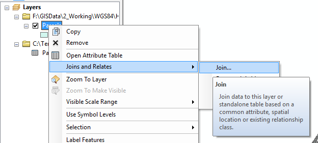
Note that the join will only work if the columns are compatible types. For the Parcel layer, I had to convert the APN column to a new column with Long Integer as the type because there were some APNs with invalid values.
Follow the steps for modeling data including:
Refer to the R for Spatial Statistics web site and the section on CART under Section 7, "Correlation/Regression Modeling" and section 8.3 from Plant's book.
Note: You are welcome to use content from previous labs to complete this lab.
© Copyright 2018 HSU - All rights reserved.